Line Charts
Evaluate time series of the dynamic network simulation as line charts - by energy plant, consumers, pipes and pumps
Overview
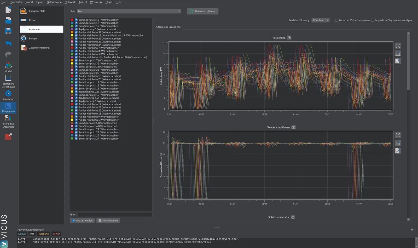
The chart view displays the time series of the dynamic simulation as line charts, grouped by the categories energy plant, pipes, consumers and pumps. One chart is created per result quantity, and one curve per network element. In addition, transfer-station charts, pump maps and a result summary are available.
Opening
Button  Charts in the main toolbar. The view is active as soon as the result folder
 <projectname>/results/ exists next to the project file. On the left you select the category:
| Category | Content |
|---|---|
| Energy plant | Time series of the heat generators and sources |
| Pipes | Heat losses of the pipe network |
| Consumers | Time series of the transfer stations and decentralized heat pumps |
| Pumps | Time series and maps of the circulation pumps |
| Summary | Energy balances over the evaluation period, see Evaluation and export |
At the top, with multiple networks, you select the network to be evaluated under Network:. A status note reports Project has been changed - results may be outdated or New data available; with  Update data you re-read the result files.
Controls
Each category page contains an element list (generators, consumers or pumps) in which you use checkboxes to determine which elements appear as curves:
| Element | Default | Meaning |
|---|---|---|
| Filter: | empty | Text filter for the element list |
| Select all / Deselect all | – | Selects or deselects all elements |
| Time averaging: | Hourly | Averaging of the time series: Hourly, Daily or Monthly |
| Lock time-axis zoom | off | Synchronizes the time-axis zoom across all charts on the page |
| Show legend in charts | off | Shows the curve legend in every chart |
Charts per Category
Which charts appear depends on the component types in the network. All time series are plotted over the simulation time.
Energy Plant
| Quantity | Unit |
|---|---|
| Source heat flux (heat input from source/heat exchanger into the network) | kW |
| COP of the heat pump | – |
| Heating power (condenser of the heat pump or ideal generator; negative values = cooling power) | kW |
| Source power (evaporator of the heat pump) | kW |
| Electric power of the heat pump | kW |
| Ground temperature (with ground heat collectors) | °C |
| Inlet temperature / outlet temperature | °C |
| Volume flow | m³/h |
| Pressure loss | bar |
Consumers
In the tab General results:
| Quantity | Unit |
|---|---|
| Heating power | kW |
| Temperature difference between inlet and outlet | K |
| Relative heat deficit (0 = demand fully covered) | % |
| Absolute heat deficit | kW |
| Inlet temperature / outlet temperature | °C |
| Volume flow | m³/h |
| Pressure loss | bar |
| For transfer stations additionally: secondary-side inlet/outlet temperature and setpoint (°C), heat flux required by the building (kW), base pressure loss and controlled pressure loss (bar) | |
| For decentralized heat pumps additionally: COP (–), electric power, heating power, source power (kW) |
The tab Transfer-station charts shows two detail charts per transfer station: Temperatures (inlet and outlet temperatures on the primary and secondary side including setpoint) and Heat fluxes (heat flux requested by the building and delivered by the transfer station) – helpful for identifying times of insufficient supply.
In practice
Whether your network reliably supplies every consumer is most quickly seen from the relative heat deficit: 0 % means full coverage, higher values indicate undersupply. If it rises, open the Transfer-station charts for the affected consumer and compare requested with delivered heat flux, as well as the secondary-side temperature against the setpoint. This tells you whether too low a supply temperature or a hydraulic bottleneck is the cause.
Pipes
| Quantity | Unit | Curves |
|---|---|---|
| Heat loss (sum over all pipe segments; negative values = heat gains) | kW | Supply, Return, All pipes |
Pumps
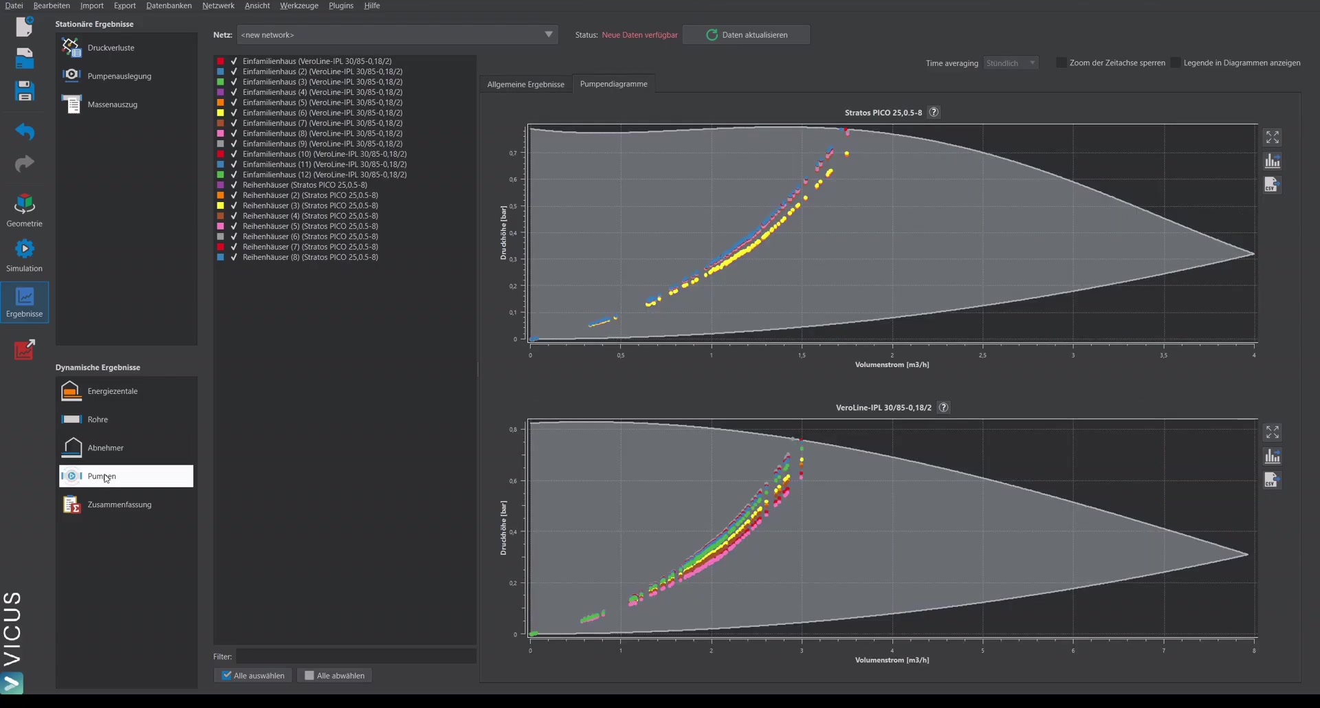
In the tab General results:
| Quantity | Unit |
|---|---|
| Electric power | W |
| Pressure head | bar |
| Volume flow | m³/h |
| Pump efficiency | % |
| Volume-flow limit exceedance (for controlled pumps) | m³/h |
The tab Pump charts plots the operating points of each pump as a point cloud in the map of pressure head [bar] over volume flow [m³/h]; if operating limits of the pump are stored, the permissible operating range is displayed as well. The prerequisite is that the outputs PressureHead and FluidVolumeFlow were written.
Exporting a Chart
Each chart has its own tool buttons:
| Button | Function |
|---|---|
 | Export the chart as an image: dialog with selection of the components (Title, Legend, Plot frame, Background, Plot background), format Bitmap or Vector graphics, output via Copy to clipboard or Export to file… |
 | Export the time-series data of the chart to a TSV file |
In addition, you can zoom into any chart with the mouse; another button resets the zoom to the full view.